The UI and the UX are the first things a user notices immediately about an app or a website. It’s the first impression – it catches attention, guides users towards the various parts and features, and leaves the longest-lasting impact too. A clean, content-centric, user-oriented, engaging UI is already half the job done, and customers will take no time to share the word about your app, guaranteeing a return on your investment.
However, people’s visual tastes keep changing, so the design world needs to adapt quickly to the landscape. This is why design trends are, well, always trending. From looks, to feel and experience, to purpose and even brand image, the design needs to be aligned across several aspects of the app while evolving to sustainably keep the app captivating yet accessible.
Here are some of the design trends that we’ve observed in 2021:
Neomorphism

This is one trend that designers have more than warmed up to. It evolved from its predecessor, skeuomorphism, but while skeuomorphism essentially retains elements to mimic their real-life subjects (for instance the icon for a clock app being a clock itself, or an amplifier UX that involves knobs, switches, and buttons like an actual amplifier), neomorphism is a new, futuristic, minimalistic and aesthetic take on it while still looking real. It plays around with the contrast, and the color scheme, bringing indifferent shades, gradients, and shadows to provide a softness to the interface.
Glassmorphism

If there is one thing designers love, it’s adding layers to their design. Glass morphism makes it more apparent by displaying the different design layers to the user, establishing a sense of priority and hierarchy to the overall UI. It has a transparent, frosted-glass aesthetic with a blurred background, and uses its color scheme to highlight it.
Dark Mode

A dark theme is a low-light UI that uses dark shades such as metal gray and black. Not only does it make for an appealing look, but a dark theme is also easier on the eye, as it makes the content pop out and reduces visual strain. Additionally, minimizing light pixels saves a lot of power and battery on the user’s device. Reduced screen glare is another major plus for a dark theme, making it a trend that’s here to stay.
Minimalism

Minimalism, by definition, uses the smallest range of materials and colors available and only very simple shapes and forms. In graphic design, limiting the extent of the elements used (shapes, images, color palettes, and so on) avoids overwhelming the user with the UI, making the design easier to use and recall, while keeping the content of the app at the focus.
Personalization

Mobile app personalization has lately acquired a lot of momentum. A tailored UX has gone from a feature to a necessity across apps and websites, with artificial intelligence and machine learning making this customization simple work. Streaming services such as YouTube, Netflix, and Spotify rely majorly on personalized UX by assessing the user’s choices and recommending shows, movies, or songs accordingly. Other apps such as planners, fitness apps, and social media apps also rely heavily on personalization to provide a unique experience to their users.
Retro Inspiration

Retro designs utilize trends, characteristics, and visual elements of the past, taking inspiration from older design styles and their features, and presenting them in a fresh manner. Most of a retro design’s appeal can be attributed to the nostalgia and charm it associates itself with, however not every old design can be refurbished into a retro theme – only the timeless designs with strong characteristics have the potential to work in any setting.
Engaging swiping experiences

Smartphones have completely moved away from having physical buttons, making more room for display. This new screen real estate gives product designers more space to experiment with, and better ways to prioritize the content. The lack of buttons also means that gestures have replaced their functionality. One example of this trend is the liquid swipe effect.
Abstract & geometric art

Across the tech industry, the approach towards products has become more emotional, and design is no exception. The way designers approach this is usually through illustrations the user can associate with on an emotional level. The illustrations also need to stand out from the rest of the products if there is a certain level of peculiarity to them. This is why illustrations are always experimented with, in terms of how abstract they are, using geometric art, playing around with the color combinations, angles, and so on. This helps make the design more unique and quirky.
Rounded Corners

This is another trend that was influenced by modern smartphone devices. Both Android and iOS flagships now feature rounded corners instead of a pointed edge. The UI mirrors the device’s curved corners and brings in a sense of uniformity across the app, making the appearance and the experience smoother and more comfortable for the users.
Voice Interaction UI

Voice-based searches, assistants, and applications have made a major foray into our lives, delivering information quickly and being extremely customizable for the user. Voice assistants such as Siri, Google Assistant, Alexa, and Bixby have tried to stand out from each other in terms of features, integrations, and customization. However, one major distinction among them is also their design. Designers are trying out novel ways to express voice-based features on apps.
Creative data visualization

Having features such as reports, dashboards, trackers, and trend monitors on your apps may present the user with a lot of data. A fun, creative way to depict this data makes sure that the experience does not get overwhelming while allowing you to present complex raw data in a simple, interactive, and visually appealing manner. You could also use help from everyday subjects and popular culture to visualize this information.
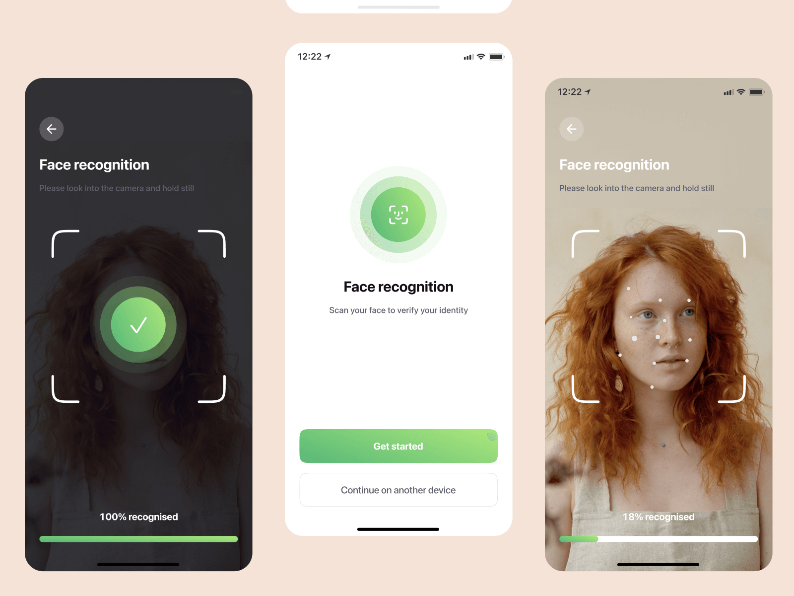
Password-less Log-in

A lot of apps are used on an everyday basis by their users, and although they may require a password for the sake of security, it becomes tiring to remember every password and enter it each time. This brings us to password-less log-in systems such as face recognition, fingerprint sensors, one-time passwords, and image log-ins.
AR/VR

Augmented reality and virtual reality have blurred the line between technology and the real world by letting us experience digital components in our everyday environment. Several industries such as media, travel, eCommerce, entertainment, science, mHealth, real estate, and education benefit greatly with the use of AR and VR, and therefore a plethora of apps associated with these industries will also adopt these technologies in their UX.
Animated Illustrations

Operative animation is crucial for a good UX, as it goes beyond aesthetics and can actually serve a lot of purposes such as explaining processes, conveying data, establishing the brand and its image, or simply recapping the user’s actions. With smartphones becoming increasingly powerful in their processing capabilities, designers enjoy greater freedom to incorporate advanced animation in their UI.
Content centric design

A content-centric design makes the UI more functional and meaningful. It also simplifies the UX making for a user-friendly and convenient experience over an artistic yet complicated one. Readability is the priority when it comes to UI/UX design. A simple menu that sets the context, fonts that adapt to screen sizes, clear branding and CTAs and an enhanced focus on readability make the design productive while keeping it responsive.
Accessible design

Certain people with temporary or permanent sensory disabilities interact differently with the product. Making your UI as inclusive as possible to make the product accessible to a wider audience will assist their experience. A text-to-speech interface or a descriptive feature that helps visually impaired people interact with your product, for instance, is an excellent addition. High contrast ratios, captions and transcripts for audio and visual media, alternate text, voice input, gesture recognition, haptic feedback are all features that can be implemented in your mobile app, and the UI needs to be accommodative of them, prioritizing your app’s accessibility.
3D visuals

Using 3D elements in UI design is not a new concept. However, it has moved away from being used primarily for entertainment-based apps to now making its way into regular apps, thanks to the higher processing capabilities of modern smartphones. 3D and faux 3D elements add a factor of realism to apps and keep the design engaging.
Did we miss out on any trend? Are you crafting your next design wave? If so, let us know and we’ll include it in our blog. If you have an idea for a mobile app but aren’t sure where to start, check out our blog that talks about the things you might possibly need to take into consideration.
However, if you have a product idea and want our team to work on it, at Codeglo we do that too! From a simple idea on a chalkboard to an actual, efficient, secure, and visually appealing app, we will take care of your entire journey with our mobile app development services. Talk to us now.


